
Introduction
The largest clinical hospital in Poland
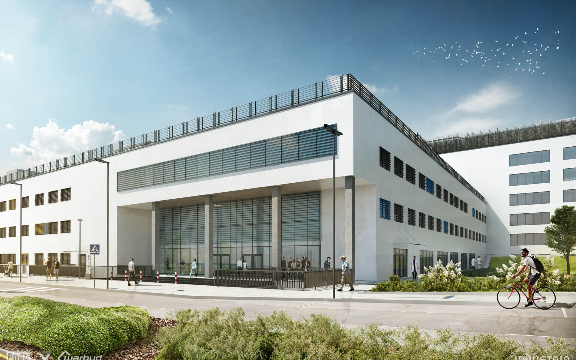
Founded in 1788, the University Hospital in Cracow is currently the largest clinical hospital in Poland. In 2019 the new headquarters of the University Hospital in Bieżanów-Prokocim district of Krakow were opened. This is a historic moment when the hospital was moved from 19th and 20th century buildings to a modern facility consisting of 21 wards with as many as 27 specialist clinics.
Planning and discovery
The challenge
The previous website of the University Hospital in Krakow did not fully meet the expectations of the staff and patients. Incorrectly organized data structure, no responsive site, a website that was not compliant with WCAG 2.0 (Web Content Accessibility Guidelines) standards, a non-intuitive site, where patients could get lost - these had been the problems we successfully solved.
The challenge we took up was to create a website based on a new content management system, which involved the need for content migration. The assumptions included implementation of WCAG 2.0 at AA level and creation of production environment (gitlab CI, docker, code quality, develop, master, webhook).
We faced the task of creating a website on a new content management system, which involved the migration of more than 30,000 articles, including a file repository and BIP. We've made the necessary 301 redirections so as not to lose organic traffic.
Simplicity
An easy-to-use website where every user can move around freely and get answers to their questions.
Accessibility
Adaptation to the WCAG 2.0 standard and creation of a Polish and English language version of the site, so that everyone can use it.
Intuitiveness
The user can easily find themselves on the site and quickly find the information they need.

Results
Results
4 months of work resulted in the creation of a website at a very high level. Not only did we implement the planned changes, but we approached the subject in a comprehensive way - from the design of the site, through consulting, to execution.
We kept project documentation, organized online workshops, where we jointly developed a new structure, proposed the most beneficial solutions to the Partner and prepared a dedicated user manual.
Results
Scope of work
UX design
We created UX functional mock-ups of key subpages of the site, which helped us to create a correct content hierarchy.
UI design
We have opted for the Atomic Design method. The new website is made up of coherent elements that fit together perfectly.
Development
Our goal was full website transparency. We used the gitlab to have full control. We have introduced Continuous Integration (Gitlab CI).

Traditional solutions in a modern way
The design of the website for the University Hospital in Krakow was based on a combination of traditional solutions and modern technologies. We wanted to adjust the website to the expectations of modern users, not forgetting that there are human beings on the other side of the screen.


WEB DESIGN

Cards UI
We decided to present each of the units on a tiled interface, which greatly enhances UX. Cards are naturally intuitive for most users because they represent physical cards with information units.


WEB DESIGN
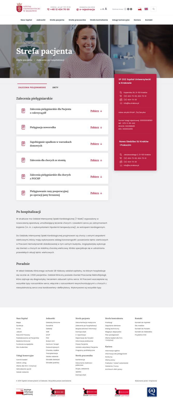
Patient zone
Desktop

Responsive website
The new website of our Partner is responsive and automatically adapts to the screen resolution. It is functional and readable on both desktop computers and tablets and smartphones.

Modules for patients
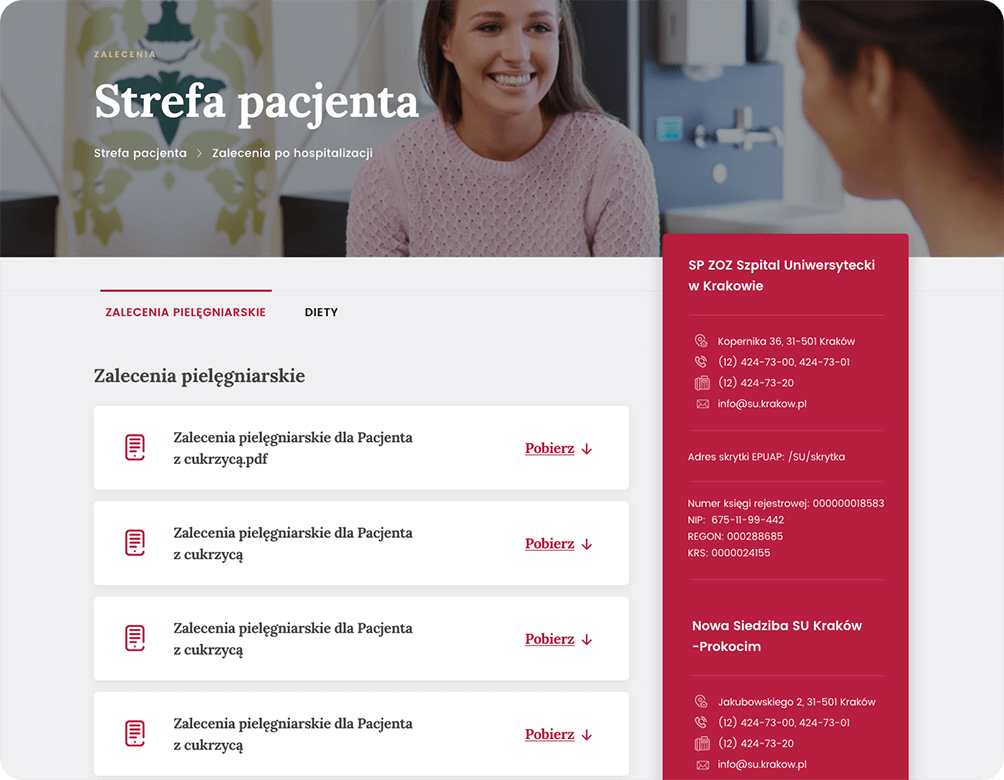
On Partner's website, we have implemented many useful modules for patients. In the interest of the users of the website of the University Hospital in Krakow, we have implemented a function that allows the patient to download nursing or dietary recommendations in .pdf format.
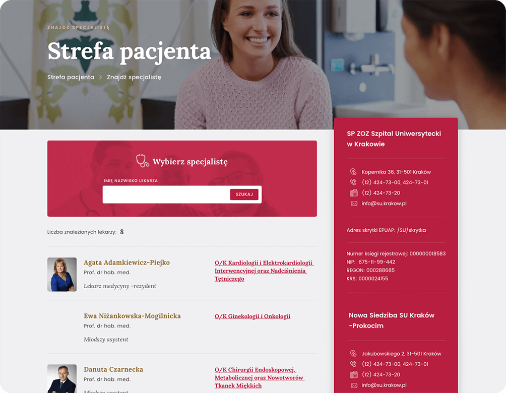
A search engine is also helpful, through which you can find a department or a specialist. We have developed an effective system for importing and updating hospital staff data, which allows you to import data with one click from a .csv file.
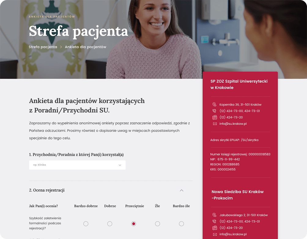
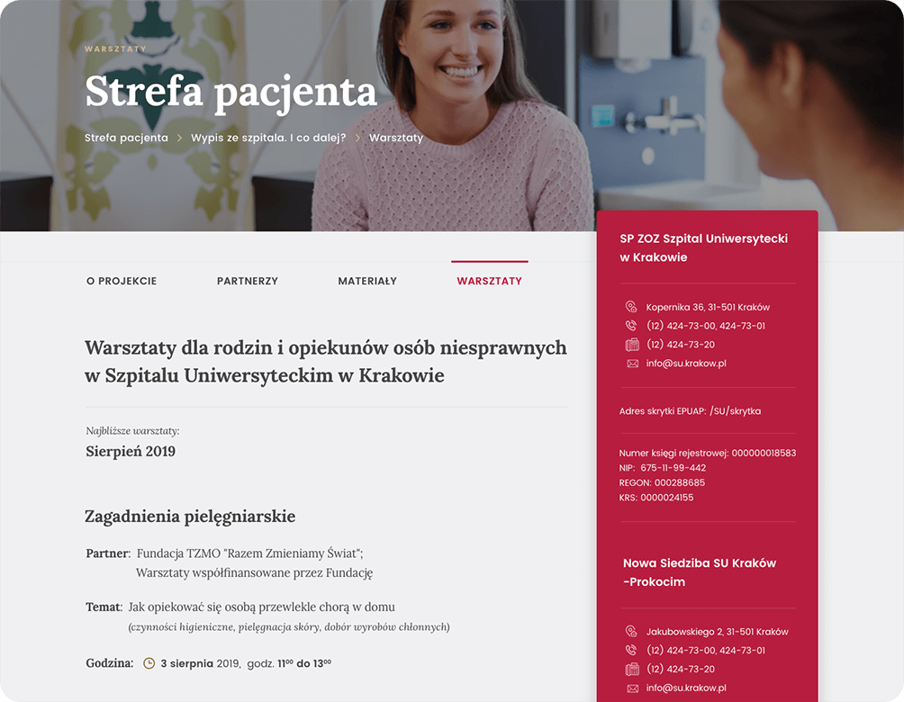
There is also an extensive anonymous satisfaction survey in the Patient Zone. Analysis of the answers can help the hospital to raise the standard of its services. Information about the workshops is also available to patients with the possibility to register for them online.
News
News
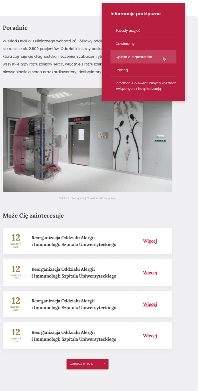
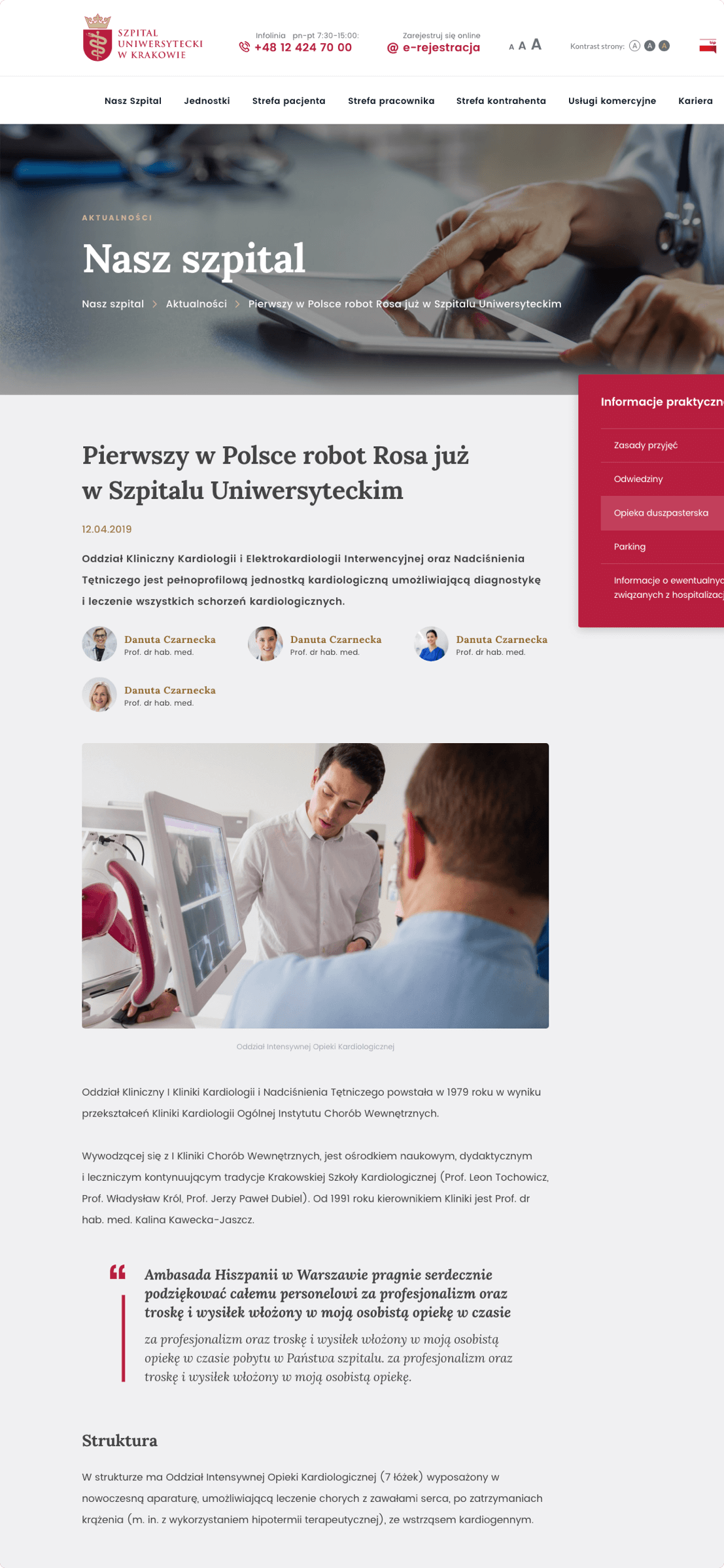
From the level of administrator, hospital staff can easily enter new entries and edit existing ones. Thanks to this functionality, both patients and hospital staff can learn about current developments in the hospital and medical industry.
Interactive hospital map
A map in 3D or 2D view allows a quick overview of which departments, specialist clinics or rooms are located in a given building. From the map level you can easily go to a subpage of a particular unit - with just one click.

WCAG 2.0
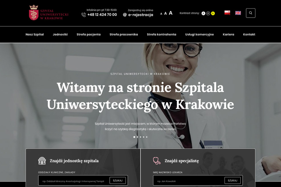
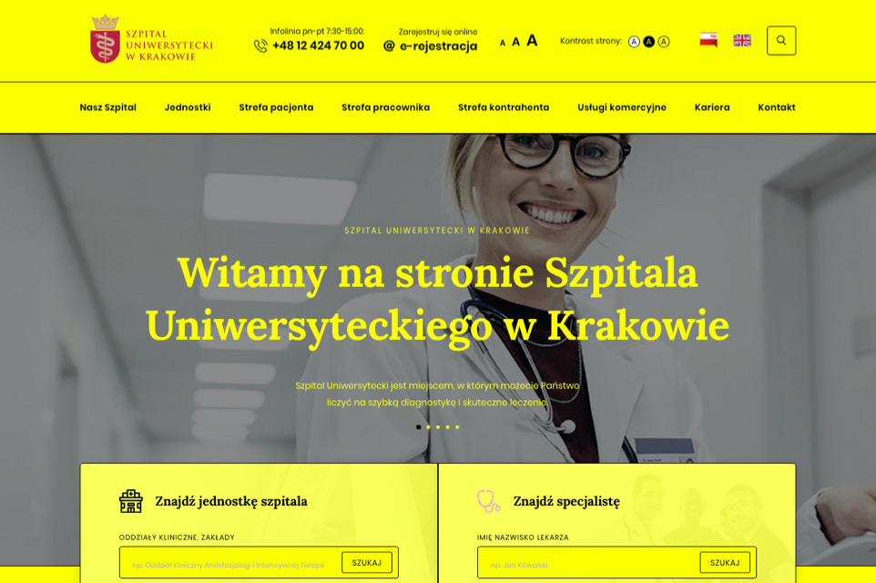
The Partner's website has been adapted to the WCAG 2.0 standard, which includes additional versions of the website that make it easier for visually impaired users to view the content, with the separation of foreground and background. Alternative pages are available in contrasting colours (black and white and yellow-black). The functionality also allows you to enlarge the text on the page.
UI Components
For the needs of the service, we have created a number of UI components which affect the consistent design of the site. We took care of every detail so that all the elements fit together perfectly and create a harmonious whole. The consistency in the graphical interface has a positive effect on the user experience.




 back to portfolio